RSMediaGallery! Advanced Slideshow Module
The Advanced Slideshow Module is an improved version of the Slideshow Module.
Download
This module can be downloaded by logging into our website using the account that holds the RSMediaGallery! active subscription, heading to Downloads > RSMediaGallery! > Explore Files > Modules > Advanced Slideshow Module
Install
In order to install the module you will have to log in into your admin panel and head to Extensions > Manage > Install tab > browse for the "mod_rsmediagallery_adv_slideshow.zip" archive downloaded from our website and hit the Upload & Install button.
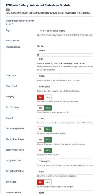
Aside from the default Joomla! module settings, the Advanced Slideshow Module offers the following configuration options:
- Tags: You can specify the tags that you have assigned for your images. This basically allows you filter out the displayed images. While typing, the current configured tags are displayed.
- Thumbnail Size: Here you can specify the maximum size of the thumbnails. If you specify the width, the height will be calculated automatically, and vice-versa.
- Slider Type: Choose the type of slideshow you wish to display: default, square, minimalist, round and clear.
- Slider Effect: Choose the effect that you wish to apply to the slideshow: cube, cube random, block, cubeStop, cubeHide, cubeSize, horizontal, showBars, showBarsRandom, tube, fade, fadeFour, parallel, boptionnd and 24 others.
- Autoplay: Yes / No. If set to yes, the slideshow will start automatically once the page is loaded.
- Stop on Hover: Yes / No. If set to yes, the slideshow will pause when the user hovers over a picture.
- Interval: Interval between transitions. This is being set up in miliseconds (1 second=1000 miliseconds).
- Display Progressbar: Displays a progress bar in the slider.
- Display Prev & Next: Displays the Previous and Next buttons in the slider.
- Display Play/Pause: Dsiplays the Play / Pause button in the slider.
- Play/Pause Position: Sets the position of the Play / Pause button: center, top left/right, bottom left/right.
- Navigation type: The type of navigation you would like to use in the slideshow. The selectable options are: none, dots, dots & thumbnails, thumbnails and numbers.
- Navigation Position: The position of the slideshow's navigation bar. The selectable options are: center, left and right.
- Show Label: Yes/No, displays the image title.
- Label Animation: Choose the labels display effect in the slideshow: slide up, left, right and fixed.
- Use Original Image: Yes / No. Use the original image instead of the thumbnail . This is useful if you want to use images with a different aspect ratio, for example a full-width slider.
- Order Images By: You can specify in what order the images are to be displayed: free ordering(the custom order you have saved for the images), random, title, description, hits (most viewed), created date and modified date.
- Order Direction: Ascending / Descending.
- Number of Items: The number of items to be displayed. Type in '0' to display all of them.
- Make images clickable: Yes / No. This will make the images displayed in the slider to either generate a link according to the URL you have configured in the image configuration or not.
- Open Images In New Page: Yes/No. If set to 'Yes', it will add target="_blank" to the image URL, opening it in a new window instead of the current one.
- Module Class Suffix: A suffix can be applied to the CSS class of the module. This allows you to style it up via your template CSS declarations.
2 persons found this article helpful.
You Should Also Read
RSMediaGallery! Responsive Slideshow Module HOT |
RSMediaGallery! Responsive Slider Module HOT |
Publish RSMediaGallery! slideshow modules in articles |


