Map
General
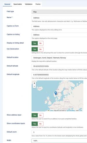
In this tab you can set up an internal name, frontend caption, default value and other frontend displaying options for your field.
- Field type: Specifies the field's type
- Name: The field's internal name (not visible in the frontend)
- Caption on form: The field name that will be displayed in the entry submission form
- Caption on listing: The field name that will be displayed in the listing
- Display on listing detail: Include the field's submitted value on the entry pages.
- Default location: Pinpoint a default location on the map
- Default latitude: Set a default value for the map's latitude
- Default longitude: Set a default value for the map's longitude
- Show address input: Display the address input in the entry submission form
- Show coordinates inputs: Display the coordinates inputs in the entry submission form
- Default zoom: Set a default zoom level (0-19)
- Width: Set the map's width
- Height: Set the map's height
- Show help tip: Choose whether to display a help tip associated with the field or not. The help tip will be displayed as a click-able question mark button to the right side of the field.
- Help tip: The text to be displayed in the help tip
- Show help text: Choose whether to display a help tip associated with the field or not
- Help text position: The help text's positioning: Inline / Block
- Help text: The text to be displayed
- Readonly: Yes / No - set the field as read only, the users will not be able to select a different location. Note that setting this option to Yes will not affect the administrators' ability to change the location in the frontend
- Additional HTML attributes: You can specify additional HTML attributes for the field
- Credits: Specify the credit cost
- Published: Render the field as published or unpublished
Searchable
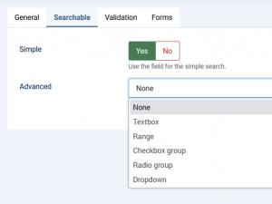
In this tab you can set up in which types of searches the field will be included.
Simple
Set whether the field can be searched for using the Simple Search module or not: Yes / No
Advanced:
Set whether the field can be searched for using the Filtering module. You can choose from one of the following types of fields that will be displayed within the module:
-
Textbox: Displays a textbox within the module, in which the user can type a keyword or a value to filter entries by. The following fields will be added in the field's backend configuration area:
- Caption: The caption that will be displayed in both the Search and Filtering modules
- Condition type: Choose a search condition: Strict (limits the search to the typed in value or keyword), Starting with value (looks for submissions that contain the provided value at the beginning), Ending with value (looks for submissions that contain the provided value at the end) or Containing value (looks for submissions that contain the provided value in between).
-
Range: Displays a vertical checkbox group containing value intervals that the module will filter entries by
- Caption: The caption that will be displayed in both the Search and Filtering modules
- Items: Please consult the Select field items configuration section below.
-
Checkbox group:
- Caption: The caption that will be displayed in both the Search and Filtering modules
- Items: Please consult the Select field items configuration section below.
- Condition type: Choose a search condition: Strict (limits the search to the typed in value or keyword), Starting with value (looks for submissions that contain the provided value at the beginning), Ending with value (looks for submissions that contain the provided value at the end) or Containing value (looks for submissions that contain the provided value in between).
-
Radio group:
- Caption: The caption that will be displayed in both the Search and Filtering modules
- Items: Please consult the Select field items configuration section below.
- Condition type: Choose a search condition: Strict (limits the search to the typed in value or keyword), Starting with value (looks for submissions that contain the provided value at the beginning), Ending with value (looks for submissions that contain the provided value at the end) or Containing value (looks for submissions that contain the provided value in between).
-
Dropdown:
- Caption: The caption that will be displayed in both the Search and Filtering modules
- Items: Please consult the Select field items configuration section below.
- Condition type: Choose a search condition: Strict (limits the search to the typed in value or keyword), Starting with value (looks for submissions that contain the provided value at the beginning), Ending with value (looks for submissions that contain the provided value at the end) or Containing value (looks for submissions that contain the provided value in between).
Searchable tab select field items configuration
Dropdowns, radio and checkbox groups items
You need to specify one item per line. An item can be written as a value|text pair or only as a value:
Value|Option or Option
You can also use the following flags: [d] to disable an option, [g] to generate an optgroup and [/g] to close the optgroup (place the [/g] tag on its own line).
E.g.:
Optgroup[g]
Disabled option[d]
Option
[/g]
NOTE that the [g] and [/g] tags can be used only by dropdown fields.
Range fields items
A range filter can be used to search for values found in certain predefined intervals. You can create one by selecting the range filter type, and using the following syntax:
lt 100|Less than 100
100 - 200
200 - 300
gt 300|Greater than 300
{range}
The {range} placeholder is optional and is used to create a custom range field.
Warning! Do not use ',' when specifying the range values.
Note: Only fields that are common for each category form will be available in the Filtering module. In other words, for a field to show up in the Filtering module, it is a must for it to be associated with every available form.
Validation
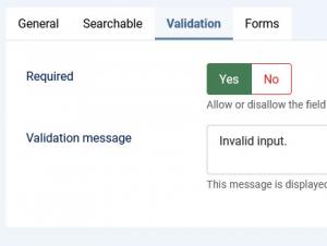
- Required: Set whether the field is required or not.
- Validation message: This message is displayed when a validation error has occured.
Forms
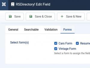
A simple layout containing a checkbox group whose items are consisted of all available forms. You can simply check which forms you want to have the field assigned to.
- Select form(s): Select the form(s) that you want to associate the field with


