Survey Table

Advanced form field with the following configuration tabs:
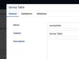
General
- Name: the name of the form component. This needs to be unique for each form. It can contain only alphanumeric chars. The name of the field is only used for internal reference - it will not be displayed in the front-end area.
- Caption: the caption or label is the text or HTML that is being displayed in the form.
- Default Value: type in the default value to be displayed when the form is accessed.
- Description: Type in a description. Depending on the Form Layout you select, this will appear as a descriptive text next to the field or through a popup.
- Published: Yes / No
Explore the functionality of this field by seeing it in action on our demo server.
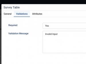
Validations
- Required: Yes / No. Enable this to make the field mandatory.
- Validation Message: This is the message displayed if field is required and not filled in or if it fails validation.
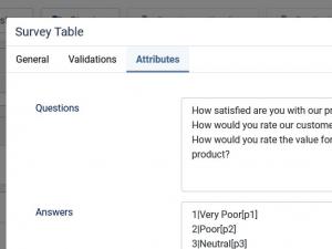
Attributes
- Questions: The questions (rows). Add one value per line.
- Answers: The answers (columns). Add one value per line, and you can specify a value and a label by separating them with a pipeline | character. e.g. max|Strongly agree. You can also use this field in a form calculation. To specify a price for a selection you will have to use the [p] syntax with the numeric value inside the square brackets, as you can see in the screenshot.
- Submission Template: Use a template to store the submission data according to this format - use {question} and {answer} as placeholders.
- Additional Attributes: Specify additional HTML attributes for this field eg. autocomplete="off"
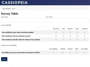
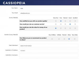
Take a quick look on how this field would look in the following areas:
- Frontend area
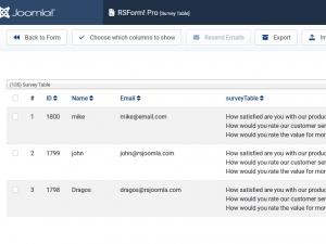
- Backend > Form > Manage Submissions area
- Frontend Manage Directory > Editing layout area
10 persons found this article helpful.
