Plugin - Modal
Enhance your visitors experience by using this fancy and intuitive plugin which allows you to display a form with a click of a button in various positions
with eye-dropping effects.
Please click on the following button in order to access the demo form:
See it in actionDownloading and Installing the plugin
Download
You can download the plugin by logging with your purchase user, then head to My Downloads > RSForm!Pro - Modules & Plugins > Plugins > "System - RSForm!Pro Modal".
Install
In the backend area go to the Extensions > Manager > Install page, and install the plugin. Next thing is to publish the plugin from Extensions > Plugins, search for the "System - RSForm! Modal" plugin.
Configuration options
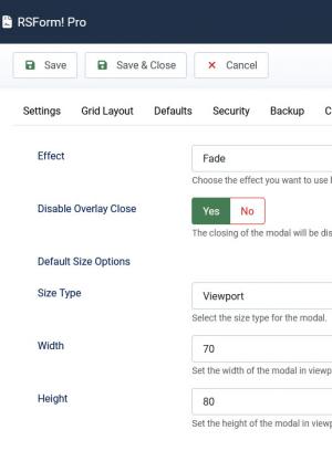
- Effects - Choose the effect your modal will display by default when the form is revealed:
- Fade
- Slide from Top
- Slide from Bottom
- Slide from Left
- Slide from Right
- Side Right
- Side Right Full Height
- Side Left
- Side Left Full Height
- Top Side
- Top Side Full Width
- Bottom Side
- Bottom Side Full Width
- Zoom
- Disable Overlay Close: Yes / No - The closing of the modal will be disabled when clicking on the background overlay.
- Size Type: Viewport / Pixels - Select the size type for the modal.
- Width: Set the width of the modal in viewport units / pixels. Defaults to 70vw / 600px
- Height: Set the height of the modal in viewport units / pixels. Defaults to 80vh / 400px
How to use the RSForm!Pro Modal plugin
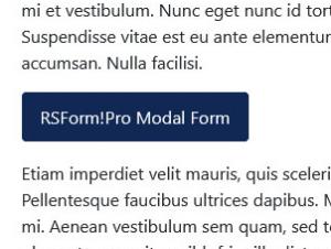
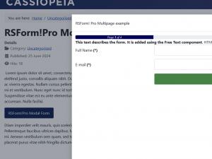
Let's assume that you want to display a button in your Joomla! article and by clicking on that particular button, a modal will be prompted. The modal will include a form you've created in RSForm!Pro.
There are three ways in which you can display this modal.
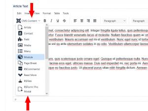
1. Using the editor's dedicated button:
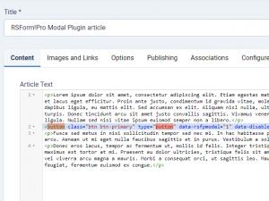
More precisely, you'll need to include a similar syntax in your article:
<button class="btn btn-primary" type="button" data-rsfpmodal="1">Open the form</button>
Whereas 1 stands for the form's Id. You can also change the effect directly in the syntax, bypassing the default one selected in the RSForm!Pro's Configuration area. The syntax will now look similar to:
<button class="btn btn-primary" type="button" data-rsfpmodal="1" data-effect="dropup" autoload="1">Open the form</button>
The list of effects attributes which you can use in the syntax would be the following:
- fade - Fade
- updown - Slide from Top
- downup - Slide from Bottom
- leftright - Slide from Left
- rightleft - Slide from Right
- sideright - Side Right
- sideright rsfpfullheight - Side Right Full Height
- sideleft - Side Left
- sideleft rsfpfullheight - Side Left Full Height
- dropup - Top Side
- dropup rsfpfullwidth - Top Side Full Width
- dropdown - Bottom Side
- dropdown rsfpfullwidth - Bottom Side Full Width
- zoom - Zoom
Prefilling values
You can also display prefilled values in your form fields, using the data-form-values attribute double quotes for the field values (notice the attribute will be opened / closed with single quotes), for example:
<button class="btn btn-primary" type="button" data-rsfpmodal="1" data-effect="dropup" data-form-values='{"FullName":"test","Email":"test@test.com", "CompanySize":["1-20","21-50"]}'>Open the form</button>
You can also set the modal size using the data-size attribute (data-size="70vw|80vh" / data-size="600px|400px") for example:
<button class="btn btn-primary" type="button" data-rsfpmodal="1" data-effect="dropup" data-size="70vw|80vh">Open the form</button>
2. Using dedicated placeholders in your article's contents:
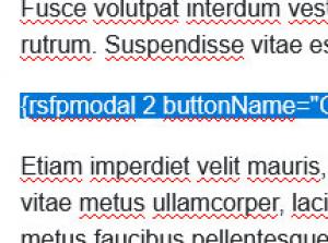
More precisely, you'll need to include a similar syntax in your article:
{rsfpmodal 1 buttonName="open form"}
Wereas 1 stands for the form's Id. You can also change the effect directly in the syntax, bypassing the default one selected in the RSForm!Pro's Configuration area. The syntax will now look similar to:
{rsfpmodal 1 effect="zoom" buttonName="open form"}
The list of effects which you can use in the syntax would be same as at point 1. Also, bypassing the default 'Disable Overlay Close' option from the configuration area can be done by using the disableclose="1" attribute:
{rsfpmodal 1 effect="zoom" buttonName="open form" disableclose="1" autoload="1"}
You can also prefill the form fields with similar attributes:
{rsfpmodal 1 effect="zoom" buttonName="open form" disableclose="1" FullName="John" Email="johndoe@rsjoomla.com"}
Prefilling a multiple selection type of field can be achieved using the following attributes:
{rsfpmodal 1 effect="zoom" buttonName="open form" disableclose="1" FullName="John" Email="johndoe@rsjoomla.com" CompanySize="1-20" CompanySize="21-50"}
Setting the modal size can be achieved using the following attributes:
  {rsfpmodal 1 effect="zoom" buttonName="open form" disableclose="1" autoload="1" size="70vw|80vh"}
  or
  {rsfpmodal 1 effect="zoom" buttonName="open form" disableclose="1" autoload="1" size="600px|400px"}
3. In menu items using dedicated CSS classes:
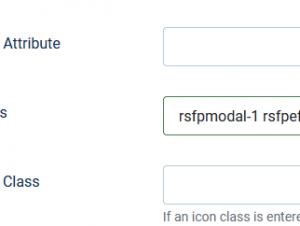
More precisely, you'll need to create a System Links > URL menu item type and add # in the Link* field (Details tab). Afterwards, include similar classes in the 'Link Type' > 'Link Class' field:
- "rsfpmodal-1" - required for the form to be opened
- "rsfpeffect-sideright" - this will change the default modal effect
- "rsfpeffect-sideright-rsfpfullheight" - in addition to the effect modal, this will display the modal in full height
- "rsfpdisableclose-1" - this will prevent the modal from closing when clicking on the background overlay
- "rsfpautoload-1" - this open the modal when the page is accessed
- "rsfpsize-70vw-80vh" - this defines the modal size in viewport units
- "rsfpsize-600px-400px" - this defines the modal size in pixels
rsfpmodal-1 rsfpeffect-sideright-rsfpfullheight rsfpdisableclose-1 rsfpautoload-1 rsfpsize-70vw-80vh
RSForm!Pro Modal - Button plugin
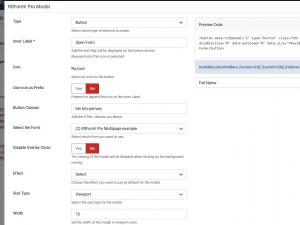
The plugin comes by default with the 'Button - RSForm!Pro Modal' plugin, which displays a button to insert RSForm!Pro Modal button into an editor area. By clicking on this button, a popup is opened allowing you to choose the form's button type and to set various default values.
- Type - Select which type of element to create, choose from Placeholder, Button and Anchor.
- Inner Label - Add the text that will be displayed on the button/anchor.
- Icon - Select an icon for the button.
- Use icon as Prefix - Prepend or append the icon to the Inner Label.
- Button Classes - Add the HTML classes you desire.
- Select the form - Select which form you want to use.
- Disable Overlay Close - The closing of the modal will be disabled when clicking on the background overlay.
- Effect - Choose the effect you want to use by default for the modal.
- Size Type: Viewport / Pixels - Select the size type for the modal.
- Width: Set the width of the modal in viewport units / pixels. Defaults to 70vw / 600px
- Height: Set the height of the modal in viewport units / pixels. Defaults to 80vh / 400px
- Autoload - Opens the modal with the form when the page is loaded.
- Preview Code - preview your code before inserting it in the editor.
- Prefill field - select which fields you want to be prefilled.
RSForm!Pro Modal Available Placeholders
The following placeholders can also be used within the Placeholder, Button or Anchor types:
- [current-link] - This placeholder returns the current URL where your modal form button is displayed;
- [current-title] - This placeholder returns the current Page Title where your modal form button is displayed;
- [referral-link] - This placeholder returns the original page URL which the user was viewing before accessing the page with the form's modal button.
How to use the Available Placeholders:
First we will need a hidden field in our form, let's assume we're naming it: referrallink. Next, while crafting our form modal syntax:
1. If you're using the Placeholder type, you can use the followings:
- referrallink="[current-link]"
- referrallink="[current-title]"
- referrallink="[referral-link]"
The syntax will look similar to:
{rsfpmodal 1 buttonName="Open Form" buttonClass="btn btn-primary" disableclose="0" referrallink="[current-title]"}
2. If you're using the Button or Anchor type, you can use the followings:
- "referrallink":"[current-link]"
- "referrallink":"[current-title]"
- "referrallink":"[referral-link]"
The syntax will look similar to:
<button type="button" data-rsfpmodal="1" class="btn btn-primary" data-disableclose="0" data-form-values='{"name":"john","email":"johndoe@test.com","referrallink":"[current-title]"}' data-effect="zoom">Open Form</button>
Make sure to add the hidden field placeholder within the User / Admin emails message to retrieve its value, for example: {referrallink:value}
Version 1.0.13
- Fixed - In some cases when using minifying tools the generated Javascript would throw an error.
Version 1.0.12
- Fixed - No longer generating h1 tag in the Modal title's HTML
Version 1.0.11
- Fixed - Using multiple modals with the exact placeholder would result in only the first one working.
Version 1.0.10
- Fixed - The "rsfpmodal-" class can now be added in any position not just at the start of the class definition.
Version 1.0.9
- Fixed - A Javascript error could occur when the form title contained an apostrophe character.
Version 1.0.8
- Fixed - A Javascript error could occur when the Joomla! core.js script is not loaded.
Version 1.0.7
- Added - Specify the width and height of the modal as a viewport or pixels.
- Updated - Values set in the 'Modal' RSForm! Pro Configuration tab are now taken into account when generating the modal code.
- Fixed - In some cases a Javascript error could occur when pre-filling form fields.
- Fixed - Overlay was not appearing over the Calendar field.
Version 1.0.6
- Fixed - Generated button element was missing the type="button" attribute.
Version 1.0.5
- Added - Joomla! 5 native compatibility - no longer needs the 'Behaviour - Backward Compatibility' plugin.
Version 1.0.4
- Added - Option to 'Autoload' the modal when the page is loaded.
Version 1.0.3
- Fixed - Form Title was not translated.
Version 1.0.2
- Added - Placeholders for the current page link [current-link], current page title [current-title] and referral link [referral-link] from where the modal button is clicked.
Version 1.0.1
- Fixed - In some cases the modal would cause a redirection error.
Initial Release
12 persons found this article helpful.


