As promised, our template portofolio is getting bigger. Today, RSPenta! - a responsive Joomla! 3.x template, best suited for business websites makes an appearance. Read this blog post for more information!
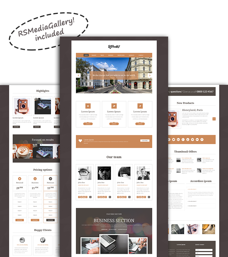
RSPenta! is backed up by exceptional after-sale service that will help you get your template up and running in no time.

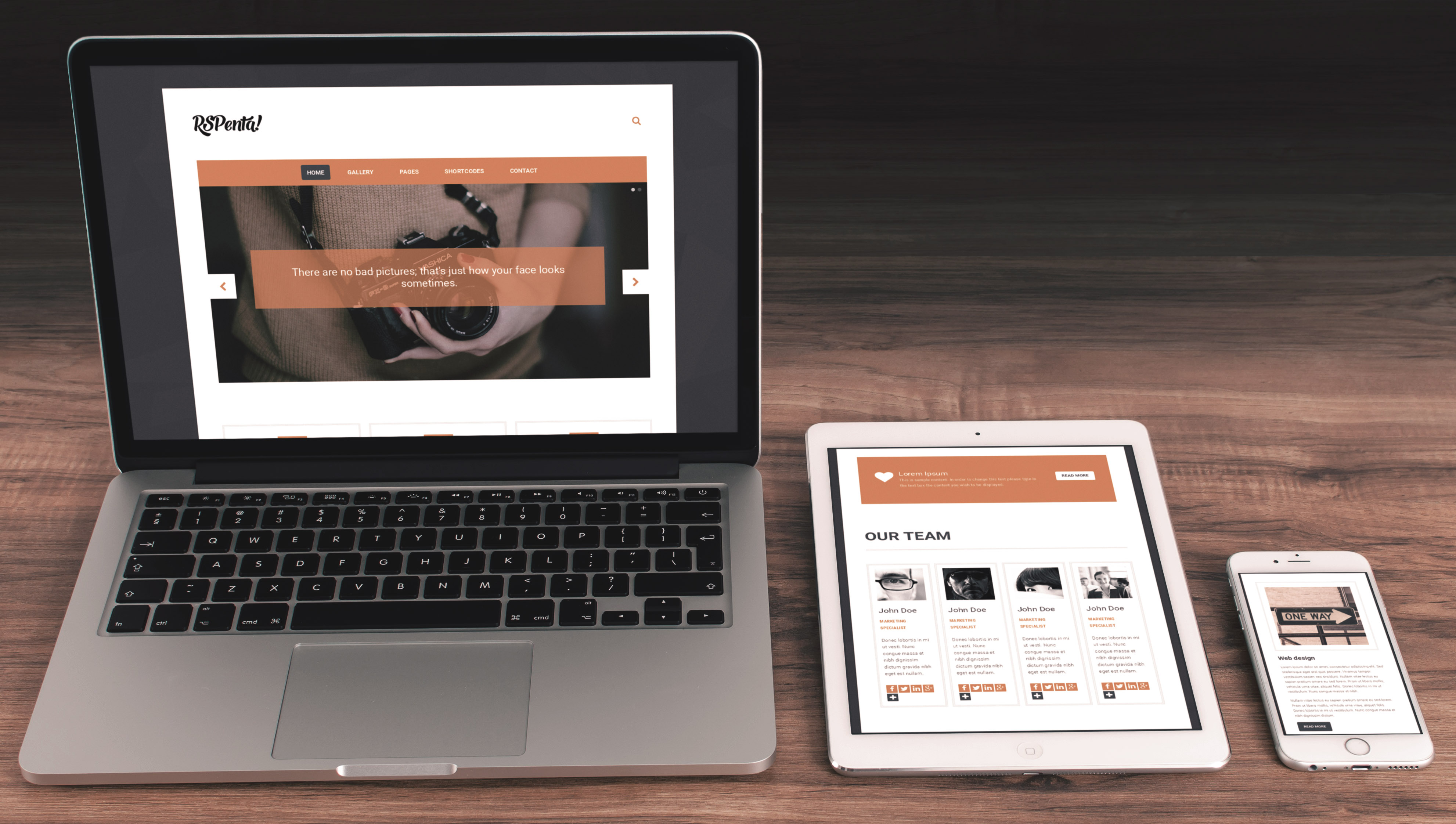
Our template is responsive. Built using one of the most known frameworks (Bootstrap), it will look great on an wide range of devices (phones, tablets, desktops)

The drag-and-drop module re-arrangement functionality of the template, allows you to create layouts as per your own needs.

The animations for fade-in content upon scroll, look beautiful and will deliver a "smoother" experience for your visitors.
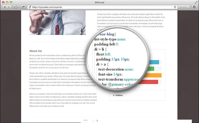
Attention to details is important! From the first to the last line of code, a strong emphasis was placed on code quality. Keeping in mind Joomla!'s best practices, we've carefully crafted a template with which you can build the perfect website for your business!
Although this might not be a new functionality (almost all of our templates come with this little plugin included), Shortcodes are one of the easiest solution when it comes down to layout editing and customizing.
Basically, it simplifies your "coding" time to a matter of minutes. The pre-defined containers can be customized with only a matter of clicks. Depending on what type of shortcode you are using, you can add/remove items, add an image , change the background color and this just scratches the surface.
In terms of accessibility, RSPenta! is built on the modern Bootstrap grid system that allows total adaptability to all types of resolutions and screen sizes, including those of mobile devices like smartphones and tablets. Here are some examples of how the pages are automatically re-arranged and resized on different resolutions:
When it comes to create a layout for your website, you are given the possibility to chose from a large sum of template positions that you can re-arrange to your own liking, by just dragging and dropping them wherever you see fit. You can think of these positions as a pre-defined grid, and you just have to fill the desired location with your content.

The default features that the template offers can be easily understood and used by beginners, however we have built the template in such manner that it allows performing CSS overrides and template overrides with ease!. More information regarding this topic and other Frequently Asked Questions can be found here.


