We keep our promises, and just like we promised this spring in the article: RSJoomla! 2014 Overview and 2015 Promise, we redesigned our website focusing on matching your information surfing needs, bringing increased quality to the level of user experience (UX) and last, but not least important, a fresh look for RSJoomla!
Responsive and intuitive
We are always so preoccupied with creating templates and extensions for others, and improving them, that we neglected our website for a little while, but no more. As you can see we have improved that overall appearance of the website, with easier surfing and guidance.
The website is responsive; you can view and surf it from any device you desire because no matter what device or browser you use, the website will adjust its layout and elements for an optimal view.
Easy navigation and search
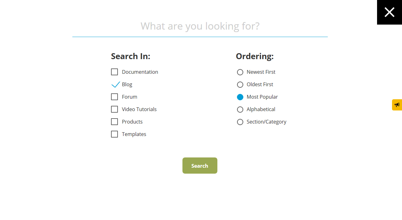
Because we focused on user experience (UX), we also perfected the search area found in the upper right corner of the website. It has never been this easy to search any and all areas of the website for information and services. Just type in what you are looking for, tick the box of where you want to search and how you want the search results to be presented. That’s all to it!

More insight for templates and extensions
The product pages, respectively the template and extension pages have been optimised to show you exactly what you are interested in. Template pages show the template in action in all sorts of instances. The extension pages show client reviews and votes in stars, and the total number of downloads so far for that extension. So basically, a vote of confidence from our users.

We do know that we still have some style and layout adjustments to make so we thank you for your patience. Even more so, if you have any suggestions or feedback, please leave us a comment in the comments section below. So check it out and tell us what you think!
To stay tuned for other news, information and tutorials, please subscribe to our blog.


Fonts too big
Hi, your website looks good but the font used by the documentation is crazy big. need to scroll down so far to go through the list where before i could see all on my screen. Someone needs a pair of reading glasses in the office? ;) Please reduce the size because it is rediculous big.
QuoteMy suggestions:
.rsj-m-small {
margin: 0;
font-size: 1.4rem;
}
also adjust normal h3 font size from 2.3 to 1.4 like above.
Regards Tom
Nice new feel
Nice new feel to the site. Clean and easy to navigate.
QuoteGreat site
Great work guys. Love the new look and feel. Keep up the good work.
QuoteThanks David!
QuoteLove the new look
Just wanted to take a minute to let you guys know I noticed the new look as soon as I got to your site. The changes to the logo and website look really good. Looking forward to using your products for many years to come! Have a great day!
Quote